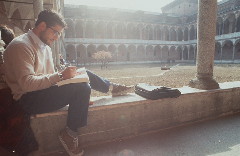
When walking around my local village I came across some picturesque views that I thought could be used in our film for a potential location. I edited the photos using my Intagram app on my iPhone allowing me to create vintage and dreamy photos so I could picture the possibility of this location in my head.
Sunday 29 January 2012
Potential filming locations/inspiration
When walking around my local village I came across some picturesque views that I thought could be used in our film for a potential location. I edited the photos using my Intagram app on my iPhone allowing me to create vintage and dreamy photos so I could picture the possibility of this location in my head.
Wednesday 18 January 2012
Filming 30/12/11
Today we filmed Hannah's beginning scenes in my bedroom, however found that it was not as successful as previous filming. This was because the inside lighting in contrast to the natural light at the beach, was very dull, giving the footage a grainy effect that we didn't want. We had some good ideas for shots, for example placing the camera in the wardrobe behind the clothes so that when Hannah flicked through them to choose a dress, we'd get an original, quirky shot of her as she opened the wardrobe doors. We tried to make the wardrobe brighter by putting a lamp behind the camera so it would light up the shot, but it didn't have the affect we wanted. We feel that we may need to redo some of these shots to achieve better results.
Poster: Take Two
Taking comments on board from our former poster we designed a new one, with our target audience in mind and we were inspired by Michelle Caplan, a collage artist.
Ways we have changed our poster to fit
- In our music video our female protagonist keeps her memories in a scrapbook which is very personal to her. Me and Emma both have scrapbook as do many of our friends, thus we know that it's a popular hobby for our target audience. Therefore this poster would draw our audience in because they can relate to it on a personal level.
- This poster is a visual representation of the female protagonists memories, creating enigma because the audience may question why such images have been included on the poster.
- We used layers in Photoshop to keep the vintage/homely vibe that our audience liked from our previous poster
We are planning to included more images that relate to our music video, and alter depending on audience feedback.
Tuesday 17 January 2012
Poster: Audience Feedback
''We really like the colour theme; it complements the genre of your music video (romance)''
''I don't understand what the silhouette has to do with your video''
''The font you used for 'The Beach Boys' really works''
''I really like the handmade feel of this poster''
''It's simple and clear and I like the pink roses as they suggest romance''
''I don't understand the 'window eye'''
This feedback has allowed me and Emma to understand what our audience want from a poster. We are planning to construct another poster taking onboard the advice and comments made about our previous work. We feel that we need to modernise our poster to appeal to a modern day audience, however we want to keep a vintage vibe to fit with our vintage song choice.
Monday 2 January 2012
Here is our original actress who we intended to use, however due to other commitments she was unable to take part in our music video. She was still happy to model for us some of the costumes and make up we want to use! These photos are very indie and girly, which is something we want to get across in our video. The make up is minimal giving a natural look, and the dresses are bright and colourful, reflecting her personality.
"The digital revolution is almost as disruptive to the traditional media business as electricity was to the candle business."
- Ken Auletta, media commentator for The New Yorker
Subscribe to:
Posts (Atom)


