Monday 26 March 2012

In what ways does your media product use, develop or challenge forms and conventions of real media products?


A music video can be categorised in terms of style:

·      Performance – Band/artist featured
·      Narrative – includes story
·      Mixture – Both performance and narrative
·      Cameo – Band/artist feature in the narrative but doesn’t perform


To gain an understanding of the forms and conventions of chosen genre (romance) I did a lot of planning and research, particularly by looking at past music videos. For example Taylor Swifts ‘Mine’ (mixure), Rihanna’s ‘We Found Love’ (miture) and Benjamin Francis Leftwich’s ‘Atlas Hands’ music videos. Through this exercise I discovered key trends and patterns that demonstrate the romance genre, for instance montage scenes, sepia tones, pretty female protagonists, strong narrative lines and romantic scenes. These common key conventions inspired me to construct my storyboard. I also came to decision to use a narrative style on our music video as it proved to be successful and popular among our audience and the videos we deconstructed.

Here are some examples of my media product compared with real media products:


I am both a producer and audience member in the postmodern age; I want to challenge the norm. I then discussed with my production partner, Emma, about how we could do this and came up with the idea of subverting the narrative and characters characteristics. I would describe the narrative of my music video and a “twisted fairytale” – It starts with a classic once upon a time, but ends in a breakup, not a ‘happily ever after”. Are character selection also reflects our choice to challenge and subvert as our male protagonist, Steve, who falls under a quirky category or stereotype, however these characters rarely featured within media text, let alone as a protagonist who ‘gets the girl’. I observed the public to see what a quirky man might wear and act like and discovered some key trends; unbranded clothing, musically motivated, ‘pump’ shoes and unkempt appearance. I took this into consideration when casting our male protagonists and we ended up selecting Steve for the role. Hannah (female protagonist), however does conform to societies stereotypes. She falls under the label of ‘girl next door’, connoting a down-to-earth persona and natural appearance. Although I would argue that this is not a typical casting for a female protagonist, as normally you would expect to view a girly girl who is involved in her appearance, however we have chosen a less obvious or classic stereotype to feature in our music video as we wish to challenge our targets audiences perception about what a ‘real person’ is.

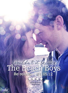
Our song choice is perhaps another subverting convention featured. Within media today there are very few re-released music videos, making our product unique as it challenges this as we attempt to ‘re-vamp’ and bring old classics back to life.

To conclude in order to create a successful media product I understand that there and key conventions that a producer must follow as the audience to read the genre correctly and with ease, however to challenge and add a fresh take on a genre is something that can better a product as it’s innovative material for the audience to digest and respond to. I wanted to create this effect with my media product and I would say I have been successful in doing so. 


How effective is the combination of your main product and ancillary tasks?

Nearly all media products are advertised and I was asked to construct an album cover and poster fit for a magazine. Firstly I looked at previous existing album covers and posters to gain a better understanding about what conventions I should be featuring. The genre of my chosen song is ‘rock and roll’ however my product is a rerelease of the iconic song (Wouldn’t it be nice – The Beach Boys) so I thought I should modernise my video and ancillaries to appeal to my target audience who are mainly females, aged 13-19. However I still wanted to capture a vintage feel, as I wanted to educate my audience that this song is a classic hit, as it is timeless.  I also understood that my ancillaries should have a strong house style to make it clear for my audience to read and understand that my music video, album cover and poster are all linked. If you click on the links provided you can see my deconstructions of my album cover and poster as why they link to well together!


Ancillary poster by Rachel Petrovics Photography

Ancillary cd cover by Rachel Petrovics Photography

NOTE:GET VIDEO OFF  EMMAS COMPUTER AND UPLOAD.

What have you learned from your audience feedback?

To me audience was one of the most important factor when creating my music video as ultimately we are creating a media text, for an audience, thus I made sure that I got regular feedback thought the production of my video.

Firstly I established my genre and song choice and then thought about what who my target audience is. I then took inspiration from a wide range of media texts such as match.com adverts, Taylor Swifts 'Mine' music video, Rihanna's 'We Found Love' music video and various conventions from [500] Days Of Summer. I also created a poll asking what films and music my target audience preferred to insure that I was on the right track.

After making decisions about my music videos direction I explained my ideas and narrative to my target audience and this was their response. This gave me the 'all go' for my music video to take place and for me and Emma to start filming.


After creating a first draft of each of my ancillaries, I showed my peers the products and asked for their opinions as to which areas needed improving. From this, I found that the fonts needed to be bolder in order to stand out, but overall the feedback gave me confidence in my products. As you can see below I added a 'soft blur' and darkened the text on 'Wouldn't it be nice' to my audience could read it more clearly. 

Before
After
I also asked my peers about what they thought about my second rough cut and this was their response. From this exercise I understood that although my video was on track as it had a very positive response there were still a few tweaks need to make the overall product even more successful. For example Cassie, aged 16 said: "The ending needs to be more definite, as it seems to trail off pointlessly. It would be a better ending if it faded out earlier on. Also, I don't understand the beach scene at the end!". Thus edited my video to appeal to her wants. 

Perviously we'd previously used a long zoom of the scrapbook, followed by a shot of the sea which faded to black), so we cut the ending earlier, blurring the scrapbook until it faded to black. This was a much more effective ending, as the closing of the book in itself brought the narrative to a definite end. This is demonstrated below: 

Before

After
I posted my video on Twitter and Facebook to get more audience feedback as I understand how important social networking influences media consumption as this is how one can create a 'buzz' about certain media product.


By sharing my end product enabled me to directly adress and target my audience for honest and instant feedback. I have now found out that my video appeals to both genders, however this contrats my initial thoughts about who my target audience are as perhaps it is wider than I originally thought.

Two members of my target audience 'favourited' my music video on youtube and I asked them why: 


James said that although he was not a fan of the music or romance genre he appreciated the video for its creativity and skill as the locations, shot choices and editing techniques were excellent. However quite excitingly James said he related to our quirky male protagonist well and liked that our music video didn't feature a classic 'hentch' alpha male.
Rachel also 'favourited' our video as she really enjoyed lots of aspects of the music video and let us know as she often uses Web 2.0 to watch music videos so she watched the video on her iPhone and commented on it using Facebook on her phone!

How did you use new media technologies in the construction and research, planning and evaluation stages?

This powerpoint presentation examines what new media technologies I used throughout the the entire production of my music video:
Media tech!

View more presentations from rachelpetro.


Tuesday 20 March 2012

The Final Cut!


This is mine and Emma's final cut for our music video! We are both really happy with the end product as we spent a great deal of time improving it from the pervious rough cut! As you can see we have added childhood videos as we took inspiration from [500] Days Of Summer! We have also taken out the ending beach scene as our target audience didn't understand our reasons for doing this and we have shortened the ending scene and added a heavy blur and fade to end the music video!

Overall I have really enjoyed creating a music video and we both think our media text is successful! 

Monday 19 March 2012

Quicktime - Screen recording of blue-sepia tones.


Here is a screen recording of me and emma editing some footage (using Quicktime software) in iMovie to demonstrate how we created the blue tones to some of our 'sad' scenes. This creates a dull atmosphere and suggests that the relationship of our protagonists is deteriorating and completly changes a happy vibe perviously demonstrated. We used this editing technique when the musics tempo slows and the piano becomes heavy, again relflecting the downfall and falling action of the narrative.

To create this tone, we firstly added a sepia effect, then added a blue tone over the top and finsishing by altering the brightness and constrast of the shot.

Sunday 18 March 2012

Rough-cut 2 (Audience Feedback)


I filmed a short interview with Ellen, aged 19 about my music video and her personal thoughts on it. As you can see I asked a wide range of questions that were relevant to the production of my piece. I asked other members of my target audience similar questions and this was their response: 

- Claire, aged 15 said:
  • " I like the opening sequence, it's fun and effective."
  • "I empathise with the female character and can relate to her."
  • "The close up of the book in the cafe is really clever as it foreshadows their relationship."
  • "The ending is good because it's a realistic portrayal of young love. I expected that to happen because the mood of the video changed towards the end."
Amelia, aged 17 said:
  • "I really liked the blue tones towards the end of the video because it showed the deterioration of the relationship and reflected the mood of the video." 
Cassie, aged 16 said:
  • "The ending needs to be more definite, as it seems to trail off pointlessly. It would be a better ending if it faded out earlier on. Also, I don't understand the beach scene at the end!" 
James, aged 18 said:
  • "I actually really enjoyed that! I felt like I could relate to the male character because he was a bit geeky and quirky, instead of a typical good looking guy! 
It is clear that my music video is on track and appealing to my target audience, however I understand there are a few 'tweaks' I must make to improve the quality of my video!  


      Rough-cut 2


      Sunday 11 March 2012

      Construction: Poster


      We decided to take a different route with our ancillary poster, after looking at the film poster for the 'One Day'. We thought that by using a photo of the main protagonists in the video, the audience immediately understand that the music video fits in with the romance genre. 


      Here's a screen shot of the 'One Day' poster alongside our chosen photo. We've edited the photo using the same blue/ sepia tones from the poster, giving it a cinematic feel. This also reflects the blue tones in our video towards the end when the couple break up, thus the poster holds hidden meaning and foreshadows the events that take place in the video.


      We added some text, giving information such as the name of the song and artist, the release date and a four star review from 'Rolling Stone' magazine (The Beach Boys were once featured in this magazine so we thought it would be a realistic choice). After showing our audience the poster at this stage, they told us that they couldn't read the text "Wouldn't it be nice", so we added a soft glow around the edge to make it stand out more.


      Here is our final ancillary poster. We decided to put "re-release" on it to make the audience aware that this is an old song made relevant to a modern audience. Using house style, we added the Capitol Records logo in the bottom left-hand corner, as we did on our album cover.


      Friday 9 March 2012

      Construction: Album cover.

      In a pervious post I showed the draft of our album cover and this post in focusing on the construction of our album cover.

      Screenshot of us working in Photoshop editing our album cover

      We experimented with different fonts for the tile sequence and asked audience members what they thought about our choices. After the feedback we came to decision to have 'Woudln't it be nice' in a handwriteen font and 'The Beach Boys' in a clear formal font to make it stand out. We added a drop shadow to the moftif in the middle to give it a 3D feel, adding to a homeade/scrapbook theme. We also added the Capital Records logo in the left corner (often found here) as it is the label that The Beach Boys are signed with. We then asked for some final feedback and our audience (and us!) really likesd it. Below is the finished product!


      Wednesday 7 March 2012

      Album cover plan.


      This is our ancillary plan for our album over. I showed Emma a really pretty vintage book cover I have at home and we thought about using it as the background image for our ancillary as it has a scrapbook feel (we are also planning to end our music video with the closing of a scrapbook). We then drafted and collaborated creative ideas about what to include in on the cover and this was the end product. There are typical girly and love object that surround the title connoting the romance genre, however it ironically subverts and challenges the title of our chosen band: The Beach Boys. 

      Monday 5 March 2012

      Rough-cut 1


      Here's our first rough cut of our video. We watched all of our footage back so far and decided on the best shots to use, and then edited them together roughly, experimenting with different editing techniques such as jump-cuts, fades and montage. We will continue to refine the cut while shooting continues and get audience feedback so we know what to improve on.

      Wednesday 15 February 2012

      Filming Diary: Cafe Scene (15/02)

      After running out of battery and not being able to finish the 'cafe scence' we re-visted Exeter to complet the scene. We thought about what props we wanted to include in the scene before hand allowing the filming to go as planned. Below I will discuss what props I used and why I did so.


      Diary: Here we see Hannah writing in her diary and drawing love hearts surrounding the purposely chossen date of 14 the Feb (Valentines Day). The perfered reading of these conventions is that there is a girl, who longs for love. However a negotiated reading could be that she has already found love and is thinking about her lover or waiting for him.


      Birdsong novel: Hannah reads this novel connoting an intelligent and romantic persona, highlighting our genre. This foreshadowns the romance that is yet to blossom. We used a POV shot of her reading the book and selected this page specifically as the words relflect the narrative: "her eyes looked up to his". Before perfoming this shot we experimented and practised shooting this shot (pre-lim) which paid off as we have created a very sucessfull shot with lots of meaning.


      iPod: Here we see Steve listening to an iPod making our music video relvant to a modern day audience. This also fits in with Steves character as music to him is of great importance. Enigma is also created as the audience may question what he is listening to? Is is something romantic? Does this refect his desir