
We decided to take a different route with our ancillary poster, after looking at the film poster for the 'One Day'. We thought that by using a photo of the main protagonists in the video, the audience immediately understand that the music video fits in with the romance genre.
Here's a screen shot of the 'One Day' poster alongside our chosen photo. We've edited the photo using the same blue/ sepia tones from the poster, giving it a cinematic feel. This also reflects the blue tones in our video towards the end when the couple break up, thus the poster holds hidden meaning and foreshadows the events that take place in the video.

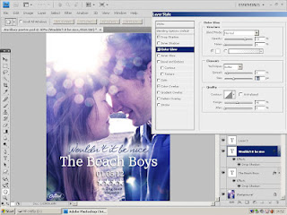
We added some text, giving information such as the name of the song and artist, the release date and a four star review from 'Rolling Stone' magazine (The Beach Boys were once featured in this magazine so we thought it would be a realistic choice). After showing our audience the poster at this stage, they told us that they couldn't read the text "Wouldn't it be nice", so we added a soft glow around the edge to make it stand out more.
Here is our final ancillary poster. We decided to put "re-release" on it to make the audience aware that this is an old song made relevant to a modern audience. Using house style, we added the Capitol Records logo in the bottom left-hand corner, as we did on our album cover.

No comments:
Post a Comment